A standardized choropleth map is a map in which the variables are standardized in one way or another to allow the comparison of data distributions across areas. The maps are standardized to relate the data usually to a specific area such as state, county or city. In these maps there is a specific "ranking" given to the different classes. Standardization includes normalizing the data according to these areas and analyzing it in a form such as percent area or per unit measurement. This map is displaying percent obesity standardized to an age group of persons within Canada. There are six classes that are paired with an obesity percentage range. Dark blue relates to a lower percent obesity while dark red shows a higher percent obesity.
Wednesday, July 13, 2011
Tuesday, July 12, 2011
Univariate Choropleth
Univariate choropleth maps are maps that only display data about one variable. The variable is expressed with colors or symbols in which case the color can vary in shades due to an increase or decrease in its value. In this map the areal data is divided by county areas. Only hues of blue are used in this map but null values and overlapping can occur which "mixes" colors. I am not sure what this map is displaying but it is using shades of blue to depict percent population in relation to another property such as ethnicity, age, or gender. I believe dark areas and "white" areas are values of either 0% or 100%, respectively.
Bivariate Choropleth
Bivariate choropleth maps are used to display and compare two sets of data and combines two different sets of graphic colors. These maps can portray two different sets of variables at the same time on the map. Its main purpose is to display the spatial distribution of the variables along with its geographical concentration. Overlapping of data can occur between the two variables. In this case their is an arbitrary legend that displays these colors. The map above is a comparison between the percent votes for Sen. John Kerry and the individual counties population in the 2000 elections.
Unclassed Choropleth Map
Unclassed Choropleth maps portray areal data without the use of classes. Instead of using classes this style of map contains as many intervals as there are areal units. This type of choropleth map allows small changes in data to be displayed under its own color. It uses a color ramp or scale to measure the changes. With the amount of data sometimes being overwhelming, it is possible that this style of map is sometimes hard for the viewer to distinguish between areas containing different values. This map is showing the infant mortality rate, per 1000 live births, in Europe compared to Italy. Darker colors have a higher mortality rate than lighter colors in the "brown" section. Blue areas are countries that have a lower infant mortality rate than Italy.
Classed Choropleth Maps
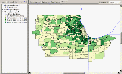
Choropleth maps typically use data ranges and graduated color shading. Data is collected and spread out over a certain interval, coinciding with a specific color palette. This data is compiled and focuses on a single theme, such as population, with data summarized to a particular geographic level such as States, Counties or ZIP Codes. The above map is an analysis of a population density within a land area, notably counties. It clearly conveys its message through a monochromatic color scheme, where darker areas are more highly populated than lighter shades of green. This map is classed because a specific color or shade is assigned to a specific set of values.
Range Graded Proportional Circle Map
Range graded proportional circle maps consists of data mapped with a circle instead of a dot. These maps are a type of point pattern analysis maps. The sizes of the circles relates to a measured variable, not the area over which it is measured. In this type of map, range graded, there is only a set number of circle sizes used. These sizes usually correlates to a specific amount of measured data. The map above uses range grading to show the number of people killed in road accidents in parts of Europe.
Continuously Variable Proportional Circle Map
(see post: a better election map-population centers)
Continuously variable proportional circle maps are point pattern maps where the point data is mapped with a circle and not a dot. The size of the circle relates to a measured variable, not the area over which it is measured. All circles that are not equal in measured data can vary in size, their is not a set number of circles sizes used. The map above uses this technique to measure and display data about population centers, or areas with a greater population density.
Subscribe to:
Posts (Atom)


