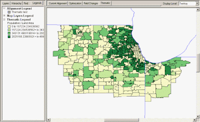
Choropleth maps typically use data ranges and graduated color shading. Data is collected and spread out over a certain interval, coinciding with a specific color palette. This data is compiled and focuses on a single theme, such as population, with data summarized to a particular geographic level such as States, Counties or ZIP Codes. The above map is an analysis of a population density within a land area, notably counties. It clearly conveys its message through a monochromatic color scheme, where darker areas are more highly populated than lighter shades of green. This map is classed because a specific color or shade is assigned to a specific set of values.

No comments:
Post a Comment